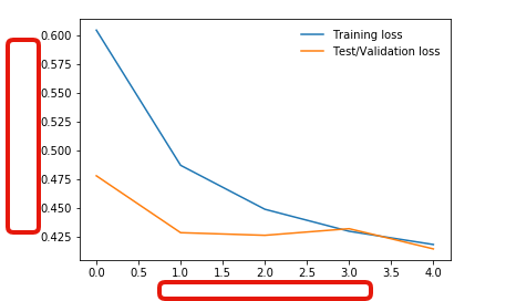
I have imported:
%matplotlib inline
%config InlineBackend.fugure_format = 'retina'
import matplotlib.pyplot as plt
to show:
plt.plot(train_losses, label='Training loss')
plt.plot(test_losses, label='Test/Validation loss')
plt.legend(frameon=False)
I have tried plt.xlabel('X axis title') and plt.ylabel('Y axis title ) and several other codes but none are working.
I'm just trying to label the x, y axis.
2条答案
按热度按时间vkc1a9a21#
See let us consider that your dataset to make the graph can be divided into 4 parts,train_losses_x,train_losses_y,test_losses_x and test_losses_y.So it can be used as following
I hope this help you.
bis0qfac2#
您可以简单地使用xlabel和ylabel函数来打印字符串。